Elevate Your Nuxt.js Dashboard - Explore Free Graph Chart Libraries for Stunning Visualizations
Starting a Nuxt.js admin dashboard project with attractive open-source data visualization also free graph charts libraries plugins
 Web Story
Graph Charts in Web Application
The use of graph charts is very common in any application to interpret the data into a data visualization that everyone can enjoy and understand. Some examples such as Lines, Pie, Bar charts, or other chart types are very visually appealing and very eye-catching on the first look into the application.
Why it is important to have Visualization
It is important because it enables people to understand and interpret large amounts of data more easily than they could with tables, spreadsheets, or other forms of data representation. Here are some reasons why data visualization is important:
Makes data understandable: Data visualization helps to simplify complex data by presenting it in a way that is easy to understand. By using charts, graphs, and other visual aids, data can be transformed into a format that is easily digestible, making it more accessible to a wider audience.
Identifies patterns and trends: Visualizations make it easier to identify patterns, trends, and correlations that may not be apparent in raw data. By presenting data in a visual format, relationships between variables can be more easily observed, and insights can be drawn more quickly.
Facilitates decision-making: Data visualization enables decision-makers to see the big picture and make informed decisions. By presenting data in a way that is easy to understand, data visualization helps decision-makers to identify patterns, trends, and outliers, and make data-driven decisions based on the insights they glean from the data.
Increases engagement: Visualizations can make data more engaging, and help to capture the attention of the audience. By presenting data in a visually appealing format, visualizations can increase engagement with the data, and encourage people to explore the data further.
Enhances communication: Data visualization helps to enhance communication by enabling people to communicate complex ideas and concepts more effectively. By presenting data in a visual format, it is easier to convey complex information to others, and enable them to understand and interpret the data more easily.
Use Case of Graph Charts
There are many open-source and free graph chart libraries for Your Nuxt.js application dashboard that you can use and combine such as Chart.js with Apex Charts.
Any data source that has set off calculations and summaries can be converted into graph charts. Some results can be made as reports and summaries to be presented in your organization. You can use charts to show a real-time data report in your application dashboard and integrate it within your own CMS.
There are several open-source graph chart libraries for JavaScript. Here are some popular ones:
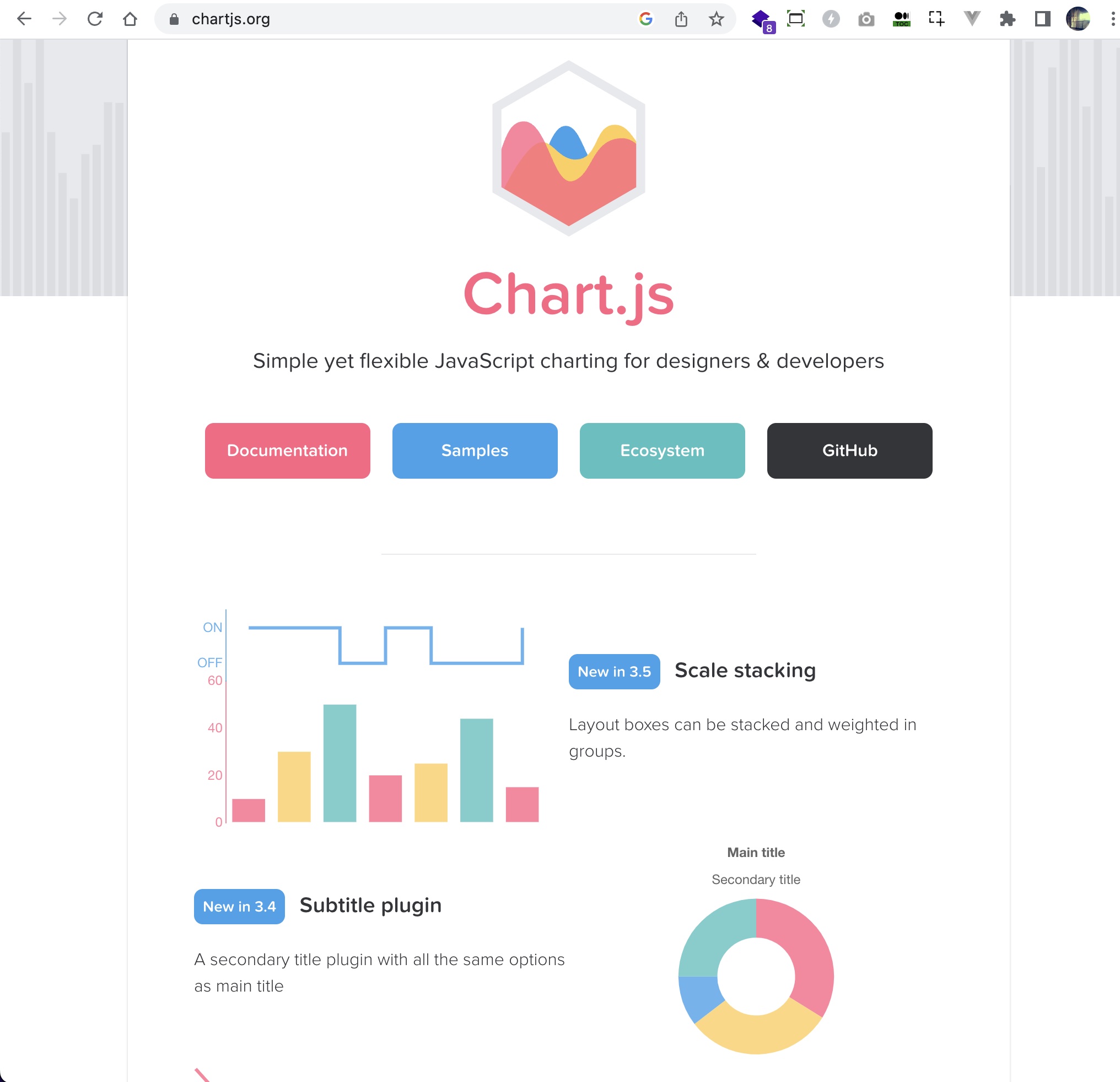
Chart.js (https://www.chartjs.org/)
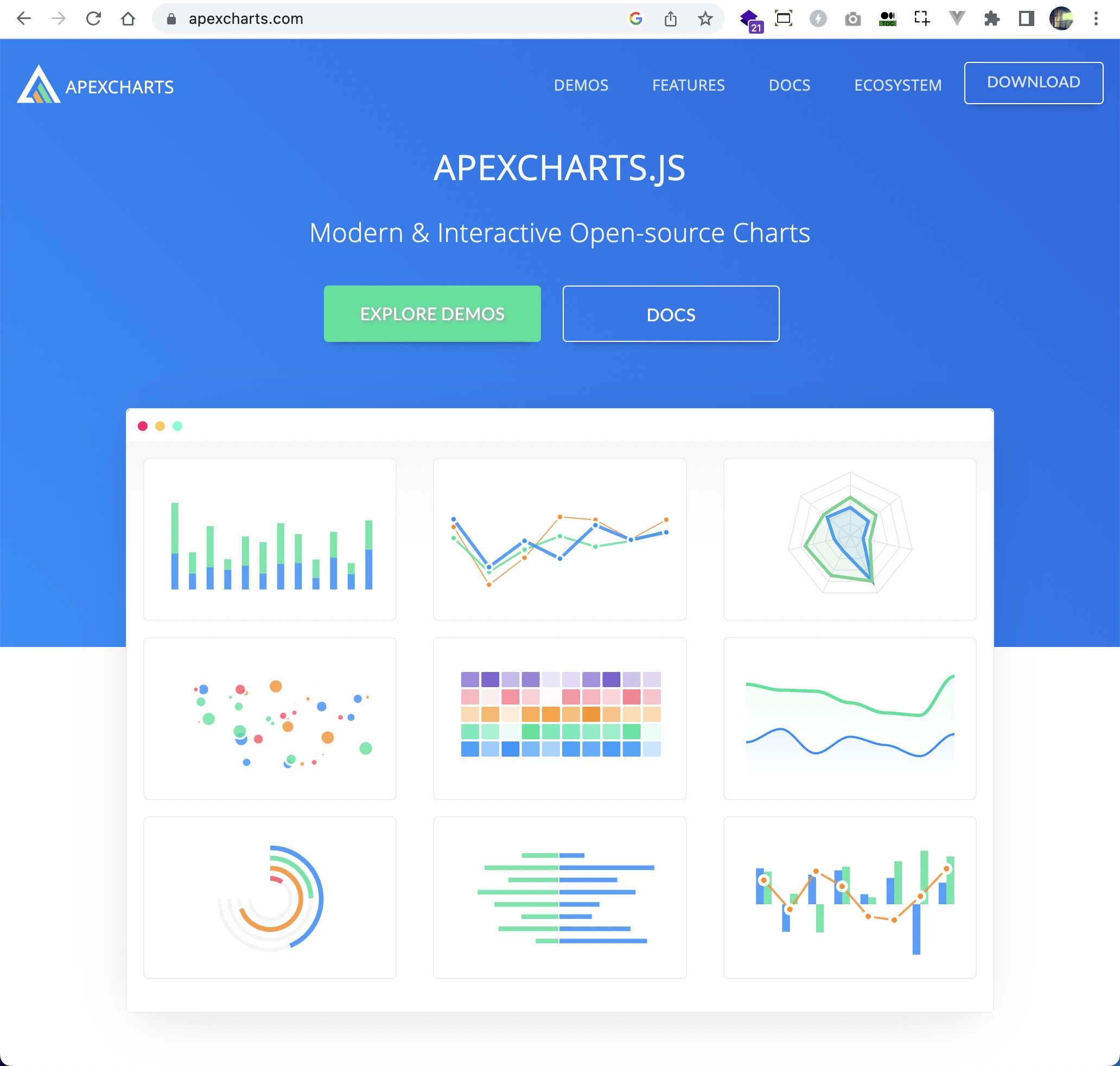
ApexCharts.js (https://apexcharts.com//)
D3.js (https://d3js.org/)
Highcharts (https://www.highcharts.com/)
Plotly.js (https://plotly.com/javascript/)
Google Charts (https://developers.google.com/chart)
All of these libraries are free to use and offer a wide range of features for creating various types of charts and visualizations. For this specific post only, I am going to write on Chart.js and ApexCharts.js graph chart libraries.
Nuxt.js Chart Libraries
Graph chart libraries such as Chart.js and Apex Charts are very popular open-source graph charts that many people use in their web applications.
There are several ways to use charts in Nuxt.js, you can add them as Vuejs plugins like this one that I want to explain it to you so you can use them directly from the nuxt.js ecosystem.
Getting Started
Add or install the graph charts in your Nuxt.js project and add them as Vue js plugins and use them in your pages or components.
Apex Charts:

Start with Yarn:
yarn add apexcharts vue-apexcharts --dev
Or with NPM:
npm install --save apexcharts
npm install --save vue-apexcharts
Configuration:
Add Apex Charts as Vue plugin components to your Nuxt.js ecosystem ./plugins/apex-chart.js and write down:
import Vue from 'vue'
import VueApexCharts from 'vue-apexcharts'

Vue.component('ApexCharts', {
  extends: VueApexCharts
})
Next add the plugins into nuxt.config.js file:
export default {
  ...
  // Plugins to run before rendering page: https://go.nuxtjs.dev/config-plugins
  plugins: [
    { src: '~/plugins/apex-chart.js', mode: 'client' }, // Apex Charts
    { src: '~/plugins/axios.js' } // Axios
  ],
  ...
}
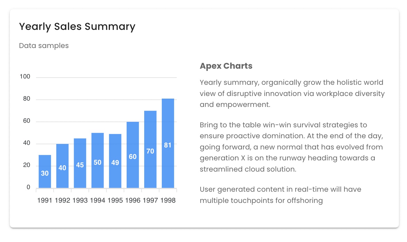
How to use Apex Charts in Nuxt.js:
<template>
    <client-only>
        <ApexCharts
          :options="{
            chart: {
              toolbar: { show: false },
              id: 'vuechart-example',
              type: 'bar'
            },
            xaxis: {
              categories: [
                1991, 1992, 1993, 1994, 1995, 1996, 1997, 1998
              ]
            },
            tooltip: {
              theme: 'light',
              fillSeriesColor: false
            }
          }"
          :series="[
            {
              name: 'series-1',
              data: [30, 40, 45, 50, 49, 60, 70, 81]
            }
          ]"
          :height="260"
          :width="300"
          chart-id="lineChart"
        />
    <client-only>
</template>

<script>
export default {
  name: 'LandingPage',
  data() {
    return {
      options: {
        chart: {
          toolbar: { show: false },
          id: 'vuechart-example',
          type: 'bar'
        },
        xaxis: {
          categories: [1991, 1992, 1993, 1994, 1995, 1996, 1997, 1998]
        },
        tooltip: {
          theme: 'light',
          fillSeriesColor: false
        }
      },
      series: [
        {
          name: 'series-1',
          data: [30, 40, 45, 50, 49, 60, 70, 81]
        }
      ]
    }
  }
}
</script>
Chart.js:

Add Chart.js from the terminal yarn add chart.js vue-chartjs and write down as Vue plugin components ./plugins/apex-chart.js in Nuxt.js plugins directory:
import Vue from 'vue'
import { Bar, Line, Doughnut, Pie } from 'vue-chartjs/legacy'
import {
  Chart as ChartJS,
  Title,
  Tooltip,
  Legend,
  BarElement,
  CategoryScale,
  LinearScale,
  LineElement,
  PointElement,
  ArcElement
} from 'chart.js'

ChartJS.register(
  Title,
  Tooltip,
  Legend,
  PointElement,
  BarElement,
  CategoryScale,
  LinearScale,
  LineElement,
  ArcElement
)

Vue.component('LineChart', {
  extends: Line
})

Vue.component('DoughnutChart', {
  extends: Doughnut
})

Vue.component('BarChart', {
  extends: Bar
})

Vue.component('PieChart', {
  extends: Pie
})
Configuration:
Next add the plugins into nuxt.config.js file:
export default {
  ...
  // Plugins to run before rendering page: https://go.nuxtjs.dev/config-plugins
  plugins: [
    { src: '~/plugins/apex-chart.js', mode: 'client' }, // Apex Charts
    { src: '~/plugins/chart.js', mode: 'client' }, // Chart.js
    { src: '~/plugins/axios.js' } // Axios
  ],
  ...
}
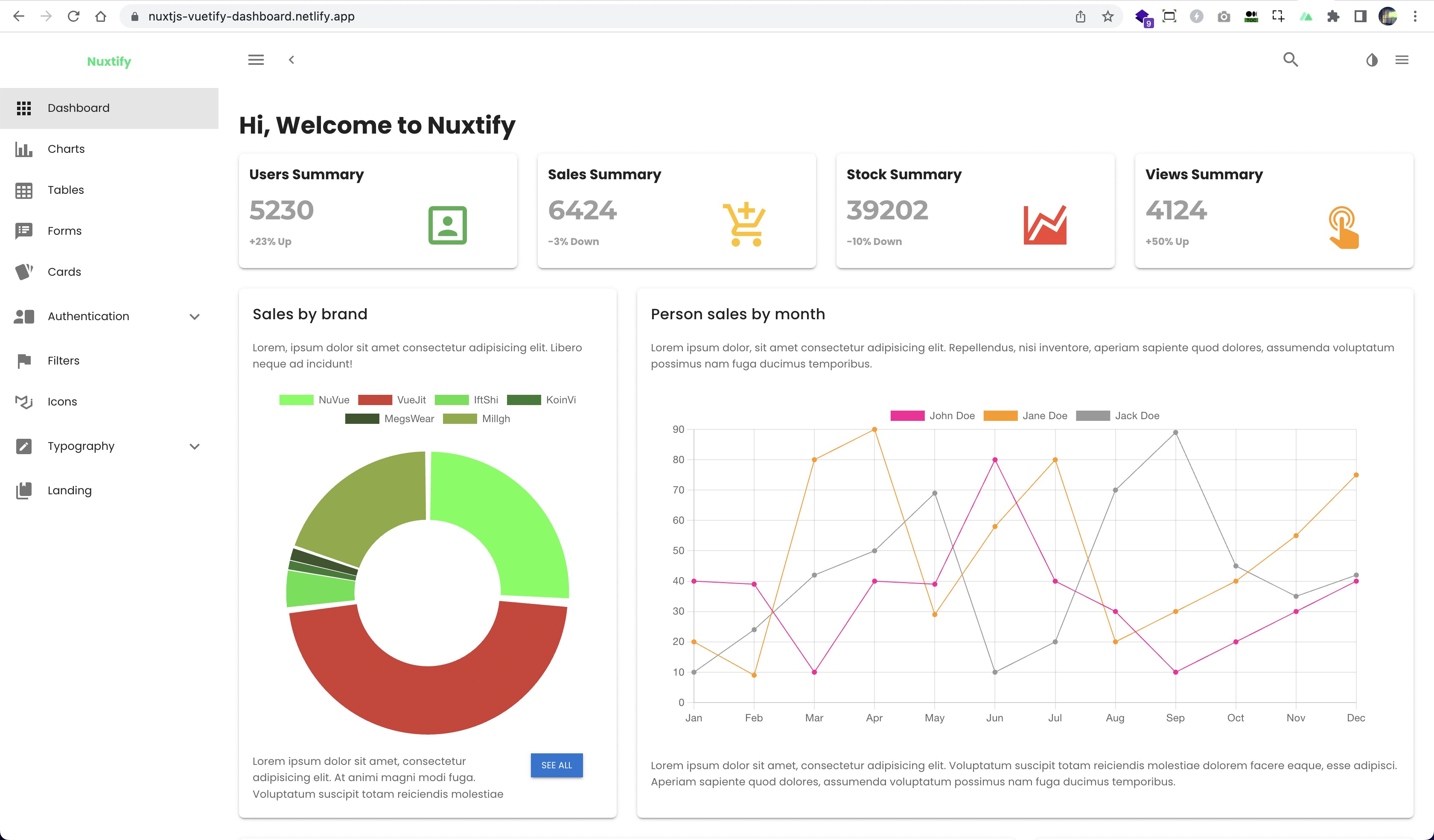
How to use Chart.js in Nuxt.js pages and components:
<template>
  <div>
    <client-only placeholder="Loading...">
      <DoughnutChart
        :chart-data="doughChartData"
        :chart-options="doughChartOptions"
        :height="430"
      />
    </client-only>
  <div>
</template>

<script>
export default {
  name: 'IndexPage',
  data() {
    return {
      doughChartData: {
        labels: ['NuVue', 'VueJit', 'IftShi', 'KoinVi', 'MegsWear'],
        datasets: [
          {
            label: 'Visualization',
            data: [72, 131, 12, 3, 4],
            backgroundColor: [
              'rgba(20, 255, 0, 0.85)',
              'rgba(200, 5, 0, 0.85)',
              'rgba(10, 220, 0, 0.85)',
              'rgba(2, 100, 0, 0.85)',
              'rgba(20, 55, 0, 0.85)'
            ],
            borderColor: 'rgba(100, 155, 0, 1)',
            borderWidth: 0
          }
        ]
      },
      doughChartOptions: {
        responsive: true,
        maintainAspectRatio: false,
        offset: 8,
        radius: 160,
        spacing: 4,
        hoverOffset: 32,
        hoverBorderWidth: 1,
        weight: 0
      },
    }
  }
};
</script>
Hope this will inspire you to add Graph Charts to your Nuxt.js. You can view this demo example on this link and here is the source code.
 Nuxt.js with Apex Charts demo
 Nuxt.js with Chart.js demo
Closing and Conclusion
The Advantage of using Graph Charts
Visualizing Data: Charts can help to present data in a visual form, making it easier to understand trends, patterns, and relationships. They can help to turn complex data sets into clear, understandable information.
Quick Insights: Charts provide a quick and easy way to gain insights into data. They can help users identify outliers, anomalies, and trends in the data that might not be immediately apparent from looking at a table of numbers.
Comparing Data: Charts can be used to compare data sets side-by-side, making it easy to see differences and similarities. This can be especially useful when trying to identify patterns or trends over time.
Customization: Most charting libraries offer a wide range of customization options, such as different chart types, colors, and labels. This allows users to tailor charts to their specific needs and preferences.
Interactive: Charts can be made interactive, allowing users to zoom in and out, highlight data points, and explore the data in more detail. This can help to engage users and make the data more accessible.
Who will benefit using Graph Charts
Executives: Executives can benefit from using charts in a dashboard to get an overview of key performance indicators (KPIs) and track progress towards business goals. They can use charts to identify trends and patterns in data, and make data-driven decisions.
Managers: Managers can use charts in a dashboard to monitor team performance and identify areas for improvement. They can track metrics such as sales, customer satisfaction, and productivity, and use charts to communicate progress to their team.
Analysts: Data analysts can use charts in a dashboard to visualize data and identify insights. They can use charts to explore relationships between different data points, and identify trends and outliers in the data.
Marketing teams: Marketing teams can use charts in a dashboard to track campaign performance and identify areas for improvement. They can use charts to monitor metrics such as website traffic, social media engagement, and conversion rates.
Customer service teams: Customer service teams can use charts in a dashboard to track customer satisfaction and identify trends in customer feedback. They can use charts to monitor metrics such as response time, resolution rate, and customer feedback scores.
Software Engineers: Engineers will be very familiar with data processing in their applications and what can be processed into information and data visualization for the next feature release with the help of existing charts.
Overall, anyone who needs to monitor and analyze data in their work can benefit from using charts in a dashboard. By providing visual representations of data, charts can help users to gain insights quickly and make data-driven decisions.
There are several ways to deploy your Nuxtjs graph chart website, you could use any hosting service provider or use free static website hosting like Vercel and Netlify.
I have been using these hosting service provider for quite some time for publish several of my web projects. As a web developer, these hosting providers have been extremely helpful in terms of hosting my static websites.
If you're a fan of React.js and its UI libraries ecosystem, you'll find a collection of React.js graph chart components in a UI library called Mantine, which offers a fully-featured components library. Officially built-in and free to use in your React.js web application, Mantine provides a range of chart components. You can also read our post about extending Mantine's default component properties here. I also wrote an article on a topic about popular React.js libraries in 2024.
Thanks for stopping by and reading this. Cheers!


