Extending React.js Components with Mantine - A Guide to Effectively Reusing the Mantine Library in Your React Web Application
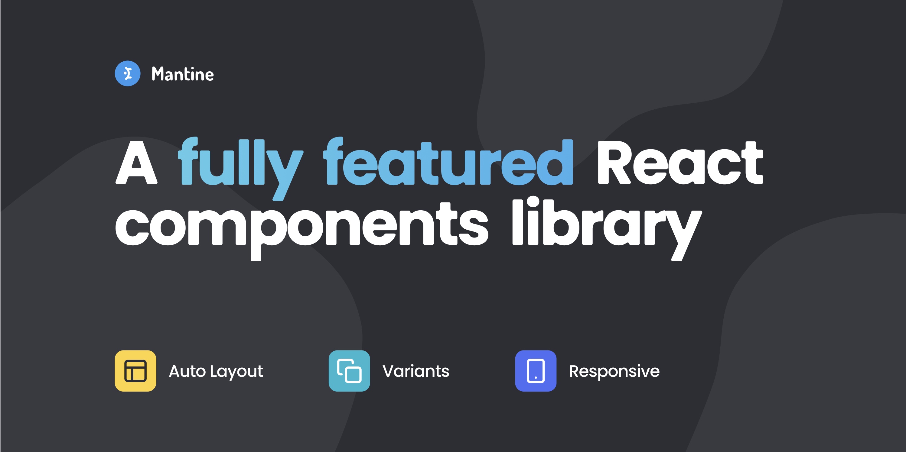
Mantine is among the robust React component libraries designed to streamline the development of modern web applications using React.js and TypeScript.
 Web Story
Mantine is a React component library designed to facilitate the development of modern web applications using React.js. Mantine provides a set of reusable and customizable React components that cover a wide range of UI elements. These components include buttons, forms, modals, notifications, and more. Mantine is compatible with React-based frameworks, including Next.js.
 Mantine - https://mantine.dev/
Mantine is known for its emphasis on accessibility, theming capabilities, and ease of use. It aims to simplify the process of building responsive and accessible user interfaces by offering a comprehensive suite of components that can be easily integrated into React projects. Notably, Mantine is an open-source library, fostering collaboration and community contribution. Moreover, it is built with TypeScript, enhancing code quality and providing a typed development experience.
Building a React application website application library using Mantine for medium to large scale as the main base of the library is a very smart choice. The available libraries help in developer productivity and save development time. Mantine offers convenient built-in hooks for front-end developers to utilize in their projects. This enhanced developer experience was something I found beneficial while working with Mantine.
Mantine offers several fundamental features that prove to be advanced and beneficial in the development of React application sites using the Mantine library. Examples of these include Mantine Hooks, Mantine Form, and Mantine Core. It aims to provide a minimalistic and straightforward API for developers to quickly integrate and use components without unnecessary complexity.
Utilize DefaultProps
DefaultProps is a function that you can employ to extend the behavior of any React component to resemble that of <Box>.
import React, { ReactNode } from 'react'
import { Grid, Flex, Text, DefaultProps, Badge, Paper } from '@mantine/core'
import { IconClock } from '@tabler/icons-react'

type OwnProps = {
  type: ReactNode | undefined
  text: string
  date: string
  read: boolean
}

interface IMessage extends DefaultProps {
  items: OwnProps[]
}

export const Notification = (props: IMessage) => {
  const { items } = props

  return (
    items.length &&
    items.map((item, i) => (
      <Paper key={`${item.date}-${i + 1}`}>
        <Grid gutter={0} p={10} columns={12} fz={13}>
          <Grid.Col span={2}>{item.type}</Grid.Col>
          <Grid.Col span={10}>
            <Text mb={5} pt={0} mt={0}>
              {item.text}
            </Text>
            <Flex justify="start" align="center">
              <IconClock size={14} alignmentBaseline="hanging" stroke={1.25} />
              <Text ml={4}>{item.date}</Text>
              {!item.read && (
                <Badge size="xs" ml={5} variant="outline">
                  new
                </Badge>
              )}
            </Flex>
          </Grid.Col>
        </Grid>
      </Paper>
    ))
  )
}
Now, you can integrate your Notification component in the same manner as the <Box> component in Mantine. Utilize any props available in <Box> within your <Notification> component. The default properties include className?: string;, style?: CSSProperties;, sx?: Sx | (Sx | undefined)[];, classNames?: ClassNames<StylesNames>;, styles?: Styles<StylesNames, StylesParams>;, and unstyled?: boolean;.
Utilize Sx
Sx is a CSSObject styles system from Mantine that can be used as styling in your React components.
import { Box, Sx } from '@mantine/core'

export default function Page() {
  const cssBoxed: Sx = {
    table: {
      marginTop: '1rem',
      marginBottom: '1rem',
      thead: {
        backgroundColor: '#f2f2f2',
        textAlign: 'left'
      }
    },
    label: {
      display: 'block',
      marginRight: '.5rem'
    },
    select: {
      borderRadius: 2,
      padding: '.75rem 1rem'
    },
    option: {
      borderRadius: 10,
      padding: '1rem'
    }
  }

  return <Box sx={{ ...cssBoxed }}>Content</Box>
}
Utilize Default Component Props
You can utilize Mantine's Button or UnstyledButton components, which share the same behavior as the Button props. Alternatively, you can employ your customized <UserButton/> component with UnstyledButtonProps designed to exhibit the same behavior as Mantine's <Button>.
import {
  UnstyledButton,
  UnstyledButtonProps,
  Group,
  Avatar,
  Text,
  createStyles,
} from '@mantine/core'
import { IconChevronRight } from '@tabler/icons-react'
const useStyles = createStyles((theme) => ({
  user: {
    display: 'block',
    width: '100%',
    padding: theme.spacing.md,
    color: theme.colorScheme === 'dark' ? theme.colors.dark[0] : theme.black,
    '&:hover': {
      backgroundColor:
        theme.colorScheme === 'dark'
          ? theme.colors.dark[8]
          : theme.colors.gray[0],
    },
  },
  userText: {
    [theme.fn.smallerThan('md')]: {
      display: 'none',
    },
  },
}))

interface UserButtonProps extends UnstyledButtonProps {
  image: string
  name: string
  email: string
  icon?: React.ReactNode
}

export function UserButton({
  image = 'https://images.unsplash.com/photo-1508214751196-bcfd4ca60f91?ixid=MXwxMjA3fDB8MHxwaG90by1wYWdlfHx8fGVufDB8fHw%3D&ixlib=rb-1.2.1&auto=format&fit=crop&w=255&q=80',
  name = 'Ann Nullpointer',
  email = 'anullpointer@yahoo.com',
  icon = <IconChevronRight size="0.9rem" stroke={1.5} />,
  ...rest
}: UserButtonProps) {
  const { theme, classes } = useStyles()

  return (
    <UnstyledButton className={classes.user} {...rest}>
      <Group align="center">
        <Avatar src={image} radius="xl" />
        <div className={classes.userText}>
          <Text size="sm" weight={500}>
            {name}
          </Text>
          <Text color="dimmed" size="xs">
            {email}
          </Text>
        </div>
        {icon}
      </Group>
    </UnstyledButton>
  )
}
Here is an example of extending Mantine DefaultProps with the Card component:
import { ReactNode, PropsWithChildren } from 'react'
import {
  Card,
  Group,
  Text,
  ActionIcon,
  rem,
  useMantineTheme,
  DefaultProps
} from '@mantine/core'

import { IconRefresh } from '@tabler/icons-react'
import { useHash } from '@mantine/hooks'
import { PopoverStack } from '@/components/popover/stack'

/**
 * Own props
 */
interface OwnProps {
  children: ReactNode
  title: string
}

const DashboardStack: React.FC<PropsWithChildren<OwnProps> & DefaultProps> = ({
  children,
  ...rest
}) => {
  const [hash] = useHash()
  const theme = useMantineTheme()
  const images = [
    'https://images.unsplash.com/photo-1449824913935-59a10b8d2000?ixlib=rb-1.2.1&ixid=MnwxMjA3fDB8MHxwaG90by1wYWdlfHx8fGVufDB8fHx8&auto=format&fit=crop&w=250&q=80',
    'https://images.unsplash.com/photo-1444723121867-7a241cacace9?ixlib=rb-1.2.1&ixid=MnwxMjA3fDB8MHxwaG90by1wYWdlfHx8fGVufDB8fHx8&auto=format&fit=crop&w=250&q=80',
    'https://images.unsplash.com/photo-1444084316824-dc26d6657664?ixlib=rb-1.2.1&ixid=MnwxMjA3fDB8MHxwaG90by1wYWdlfHx8fGVufDB8fHx8&auto=format&fit=crop&w=250&q=80'
  ]
  const { title = 'Review pictures' } = rest

  return (
    <Card key={hash} withBorder shadow="sm" radius="md" mb={10} {...rest}>
      <Card.Section withBorder inheritPadding py={5}>
        <Group position="apart">
          <Text size={13} color="dimmed" weight={500}>
            {title}
          </Text>
          <Group spacing={5}>
            <ActionIcon variant="light">
              <IconRefresh size={rem(14)} />
            </ActionIcon>
            <PopoverStack />
          </Group>
        </Group>
      </Card.Section>
      <Card.Section inheritPadding mt="sm" pb="md">
        {children}
      </Card.Section>
    </Card>
  )
}
export { DashboardStack }
Utilizing the component like this, extending the properties of the Mantine <Box/>:
<DashboardStack title="Dashboard Reviews">
  <a>test</a>
</DashboardStack>
All of these capabilities can be achieved with React and TypeScript, making your front-end project reusable and customizable. I have also written about how to create a React component with an object as props in TypeScript. Leveraging fundamental JavaScript concepts, I use React.js with the implementation of some React hooks features, such as useEffect and useState, combined with JavaScript functions like fetch(), map(), find(), some(), sort(), flatMap(), and others.
With TypeScript and the latest version of Mantine UI now featuring CSS variables, you can enhance your React Mantine UI projects with the latest feature releases. If you are getting started with Mantine UI, you can read our blog post on how to use Mantine default properties.
** All images and logos belong to their respective owners.
I hope this helps! Let me know if you have any questions.
Topics
Recent Blog List Content:
Most popular React.js UI Libraries - Exploring Mantine and Material-UI
How To Work With Relationship RESTful API Endpoints In React.js
Archive
Stories
Code Road’s Web Development Story List
Code Road
Material UI Administrator Dashboard with Next.js
Code Road
Nuxt.js and Chakra UI Website Template
Code Road
How To Use Apex Charts in Nuxt.js Web Application Dashboard
Code Road
Nuxt.js Dynamic Sitemap and Feed for Static Websites
Code Road
Nuxt.js SEO Head Component
Code Road
Chart.js in Nuxt.js: How To Implement
Code Road
On-page SEO List to Have in your Nuxt.js Static Website
Code Road
How To Build VueJS Geo Location Weather Application
Code Road
MySQL Docker Container with MySQL Workbench and PhpMyAdmin
Code Road