Exploring Mantine and Material-UI - A Comprehensive Guide to React UI Libraries
Exploring Mantine and Material-UI, staying on top of the latest tools and technologies is crucial for building modern and visually stunning user interfaces in 2024.
 Web Story
Introduction
In the realm of front-end development, React has emerged as a powerful tool for building dynamic user interfaces. To expedite the development process, developers often rely on UI libraries that offer pre-designed components and styling. Among the myriad of choices available, Mantine and Material-UI stand out as two prominent options. In this guide, we'll delve into the features, strengths, and differences of Mantine and Material-UI, empowering you to make an informed decision for your next React project.
Features
Each library provides its own set of features to assist developers in building robust and efficient React applications.
| Component Library | Material-UI | Mantine |
|---|---|---|
| Core Components | Buttons, Inputs, Checkboxes, Radios, Selects, Icons, etc. | Buttons, Inputs, Checkboxes, Radios, etc. |
| Navigation Components | App Bar, Drawer, Tabs, Breadcrumbs, Menu, etc. | Navigation, Tabs, SideMenu, Breadcrumbs, etc. |
| Data Display Components | Tables, Lists, Cards, Avatars, Badges, etc. | Tables, Lists, Cards, Avatars, Badges, etc. |
| Feedback Components | Dialogs, Snackbars, Tooltips, Progress Indicators, etc. | Modals, Notifications, Toasts, Loaders, etc. |
| Forms Components | Form Controls, Input Validation, Autocomplete, etc. | Form Elements, Form Groups, Validation, etc. |
| Layout Components | Grid, Container, Paper, Divider, Drawer, etc. | Grid, Container, Header, Section, etc. |
| Typography Components | Typography, Text Fields, Rich Text, etc. | Typography, Text Fields, Code, etc. |
| Utilities | Theme Provider, CSSBaseline, Transitions, etc. | Theming, Hooks, Utils, etc. |
Understanding Mantine:
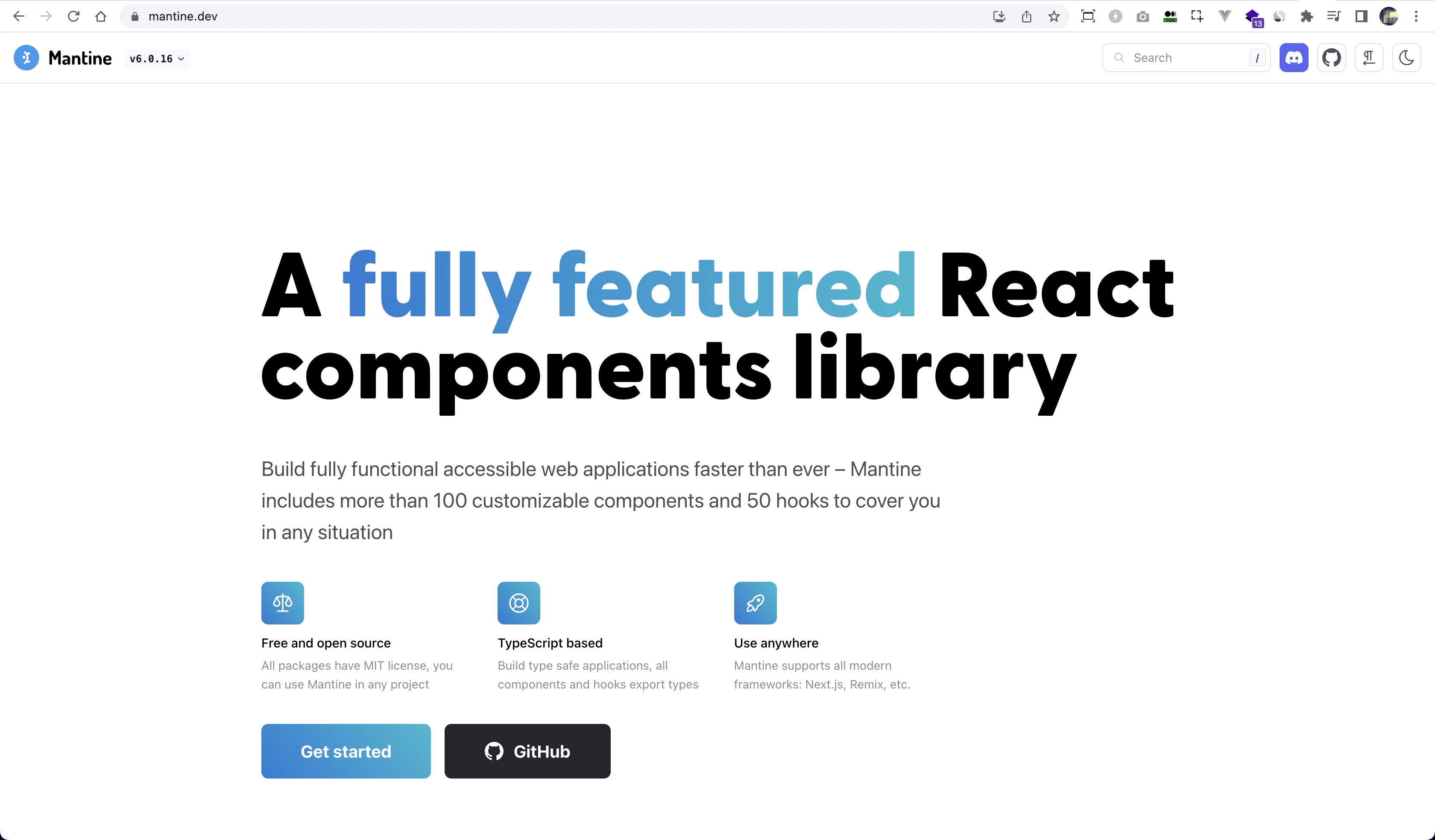
Mantine is a modern React UI library that emphasizes developer experience, accessibility, and performance. Mantine offers a diverse range of customizable components, hooks, and utilities tailored for building sleek and responsive user interfaces. Here are some key features of Mantine:
-
Component Library: Mantine provides a rich collection of UI components such as buttons, inputs, modals, and more, enabling developers to rapidly construct complex layouts with minimal effort.
-
Theme Customization: With Mantine, theming is a breeze. Developers can effortlessly customize the look and feel of their applications by adjusting variables like colors, typography, and spacing to match their brand identity.
-
Accessibility: Accessibility is prioritized in Mantine, ensuring that components are usable and navigable for users with disabilities. Features like keyboard navigation, ARIA attributes, and focus management are seamlessly integrated into Mantine components.
-
Performance Optimization: Mantine is engineered for performance, with a keen focus on minimizing bundle size and optimizing rendering speed. By leveraging techniques like code splitting and memoization, Mantine ensures snappy user experiences even in complex applications.
Understanding Material-UI:
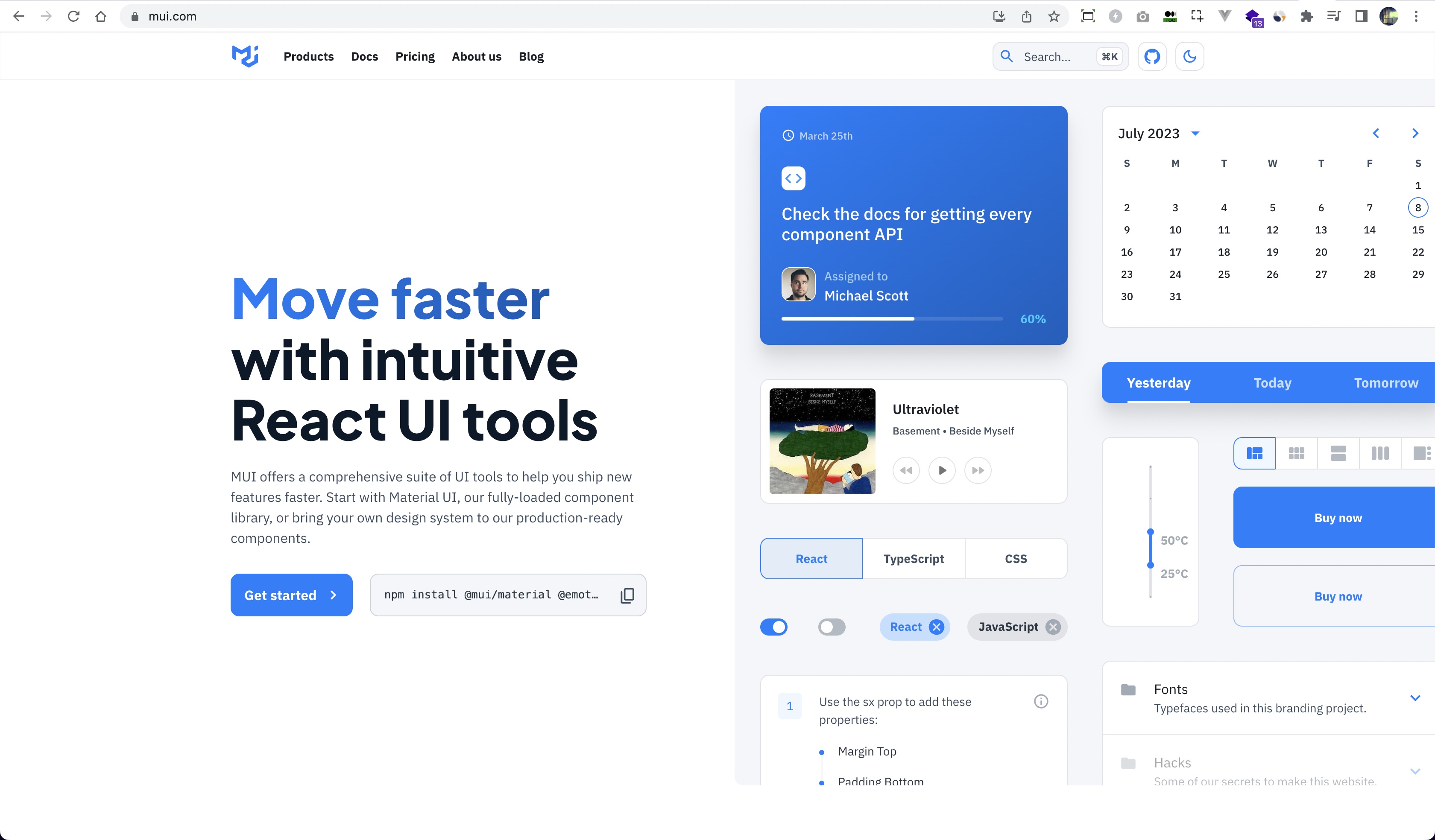
Material-UI is a widely acclaimed React UI framework that implements Google's Material Design principles. Backed by a vibrant community and maintained by a team of dedicated developers, Material-UI offers a comprehensive suite of components and utilities inspired by Material Design. Here's what sets Material-UI apart:
-
Material Design Compliance: Material-UI adheres closely to Google's Material Design guidelines, offering components and styles that reflect the aesthetic and behavior prescribed by the design language. This ensures consistency and familiarity for users accustomed to Material Design.
-
Extensibility: Material-UI provides a robust foundation for customization and extension. Developers can easily override default styles, create custom themes, and extend components to suit their specific design requirements, facilitating seamless integration with diverse projects.
-
Component Ecosystem: Material-UI boasts an extensive ecosystem of components covering a wide range of use cases, from basic UI elements like buttons and cards to more specialized components like data grids and navigation drawers. This rich assortment empowers developers to construct complex interfaces with ease.
-
Community Support: With a large and active community, Material-UI enjoys widespread adoption and support. Developers can benefit from a wealth of resources, including documentation, tutorials, and third-party plugins, accelerating the learning curve and troubleshooting process.
Popularity
Mantine:
- GitHub Stars: Mantine has garnered approximately 6,000 to 7,000 stars on GitHub, indicating a growing interest and adoption among developers.
- npm Downloads: Mantine receives tens of thousands to hundreds of thousands of weekly downloads on npm, suggesting widespread usage in React projects.
- Community Engagement: Mantine has an active community on platforms like GitHub, Stack Overflow, and Discord, with regular contributions, discussions, and support interactions.
Material-UI:
- GitHub Stars: Material-UI boasts a substantial number of stars on GitHub, ranging from 70,000 to 80,000, reflecting its widespread popularity and adoption in the React ecosystem.
- npm Downloads: Material-UI consistently receives hundreds of thousands to millions of weekly downloads on npm, indicating its extensive usage in projects of varying scales.
- Community Engagement: Material-UI has a large and active community across multiple platforms, including GitHub, Stack Overflow, and Discord, with extensive documentation, discussions, and contributions.
While these numbers provide a general sense of the popularity and adoption of Mantine and Material-UI, it's essential to consider additional factors such as project requirements, developer preferences, and specific use cases when choosing a UI library for a React project. Both Mantine and Material-UI offer valuable features and cater to different needs, ensuring developers can find the right tool for their projects.
Integration
Integrating Mantine and Material-UI components into a React.js web application involves similar steps, as both libraries follow React's component-based architecture. Below, I'll outline the general process for incorporating components from each library into a React application:
-
Installation:
Mantine: Install Mantine using npm or yarn by running
npm install @mantine/coreoryarn add @mantine/corein your terminal.Material-UI: Install Material-UI using npm or yarn by running
npm install @mui/materialoryarn add @mui/material. -
Importing Components:
After installation, import the desired components from Mantine or Material-UI into your React components. For example:
// Mantine import { Button, Input } from '@mantine/core' // Material-UI import { Button, TextField } from '@mui/material' -
Using Components:
Once imported, you can use the components within your JSX code by simply including them as JSX elements. Pass any necessary props to customize their behavior and appearance.
// Mantine const MyComponent = () => { return ( <div> <Button variant="outline">Click Me</Button> <Input placeholder="Enter your name" /> </div> ) } // Material-UI const MyComponent = () => { return ( <div> <Button variant="contained" color="primary"> Click Me </Button> <TextField label="Name" /> </div> ) } -
Theming (Optional):
Both Mantine and Material-UI allow for easy theming to customize the appearance of components according to your application's design. You can create custom themes and override default styles as needed.
-
Mantine:
import { MantineProvider, Container } from '@mantine/core' const App = () => { return ( <MantineProvider> <Container>{/* Your components here */}</Container> </MantineProvider> ) } -
Material-UI:
import { ThemeProvider, createTheme } from '@mui/material/styles'

const theme = createTheme({
  // Customize theme properties
})

const App = () => {
  return (
    <ThemeProvider theme={theme}>
      {/* Your components here */}
    </ThemeProvider>
  )
}
-
-
Customization: Both libraries offer extensive customization options to tailor components to your specific needs. Refer to the documentation of each library for details on available props, customization APIs, and best practices.
-
Handling Events and State: React's event handling and state management principles apply when working with components from Mantine and Material-UI. You can use event handlers like onClick, onChange, etc., and manage component state using React's useState or useContext hooks as needed.
By following these steps, you can seamlessly integrate components from Mantine and Material-UI into your React.js web application, leveraging their respective features, customization options, and theming capabilities to create rich and responsive user interfaces. Remember to refer to the documentation of each library for detailed usage instructions, component APIs, and best practices.
Components
Material-UI and Mantine offer similar categories of components, and many of these categories overlap with similar components. Here's a comparison of some common components found in both libraries:
| Component | Material-UI | Mantine |
|---|---|---|
| Accordion | <Accordion/> | <Accordion/>, <Accordion.Item/>, <Accordion.Control/>, <Accordion.Panel/> |
| Alert | <Alert/> | <Alert/> |
| AppBar/AppShell | <AppBar/> | <AppShell/> |
| Button | <Button/> | <Button/> |
| Box | <Box/> | <Box/> |
| Checkbox | <Checkbox/>, <CheckboxGroup/> | <Checkbox/> |
| Card | <Card/>, <CardActionArea/>, <CardActions/>, <CardContent/>, <CardHeader/>,<CardMedia/> | <Card/>,<Card.Section/> |
| Drawer | <Drawer/>, <SwipeableDrawer/> | <Drawer/> |
| Dialog | <Dialog/>, <DialogTitle/>, <DialogContent/> | <Modal/>, <ModalBody/>, <ModalHeader/> |
| Divider | <Divider/> | <Divider/> |
| Grid/Flexbox | <Grid/>, <GridContainer/>, <GridItem/> | <Flex/>, <Container/>, <Row/>, <Col/>, <SimpleGrid/>, <Box/> |
| Input | <TextField/>, <OutlinedInput/>, <InputBase/> | <Input/>, <Textarea/>, <Select/>, <Switch/> |
| Icons | <Icon/>, <IconButton/> | <Icon/>, <ActionIcon/> |
| Radio | <Radio/>, <RadioGroup/> | <Radio/> |
| Select | <Select/>, <NativeSelect/> | <Select/> |
| Snackbar/Toast | <Snackbar/>, <SnackbarContent/> | <Notification/>, <Toast/> |
| Stack/Group | <Stack/> | <Stack>, <Group/> |
| Tabs | <Tab/>,<TabContext/>, <TabList/>, <TabPanel/>, <TabScrollButton />,<Tabs/> | <Tabs/>, <Tabs.List/>,<Tabs.Tab/>,<Tabs.Panel/> |
| Tooltip | <Tooltip/> | <Tooltip/> |
| Typography | <Typography/>, <Text/> | <Text/>, <Title/> |
| Paper | <Paper/> | <Paper/> |
| Table | <TableContainer/>, <Table/>, <TableHead/>, <TableRow/>, <TableCell/>,<TableBody/> | <Table/>,<Table.THead/>,<Table.Tr/>, <Table.Td/>,<Table.TBody/> |
These are just some examples of common components shared between Material-UI and Mantine. Both libraries offer a wide range of additional components and variations within each category, allowing developers to choose the components that best suit their project requirements and design preferences.
Sx Props
Both Material-UI and Mantine provide support for the sx prop, which allows developers to apply custom styles directly to components using inline CSS syntax. This feature is particularly useful for quickly styling components without the need to create separate CSS files or classes.
Here's a brief overview of how the sx prop is utilized in both libraries:
Material-UI:
In Material-UI, the sx prop is a shorthand for applying custom styles to components. It accepts an object containing CSS properties and values, similar to inline styles in regular HTML. Here's an example of using the sx prop in Material-UI:
import { Button } from '@mui/material'
return (
  <Button
    sx={{
      backgroundColor: 'primary.main',
      color: 'white',
      '&:hover': { backgroundColor: 'primary.dark' }
    }}
  >
    Submit
  </Button>
)
Mantine:
Similarly, Mantine also supports the sx prop for styling components. It follows the same concept of accepting an object containing CSS properties and values. Here's an example of using the sx prop in Mantine:
import { Button } from '@mantine/core'
return (
  <Button
    sx={{
      backgroundColor: '$primary',
      color: 'white',
      '&:hover': { backgroundColor: '$primary-dark' }
    }}
  >
    Submit
  </Button>
)
In both examples, we apply custom styles to a Button component using the sx prop. The styles include setting the background color, text color, and defining a hover effect.
Overall, the sx prop provides a convenient way to apply custom styles directly to components, enhancing the flexibility and ease of styling in both Material-UI and Mantine.
Conclusion
Both Mantine and Material-UI represent formidable choices for React developers seeking to streamline the UI development process. While Mantine offers a lightweight, customizable, and performance-oriented solution, Material-UI shines with its adherence to Material Design principles, extensive component ecosystem, and robust community support. Ultimately, the choice between Mantine and Material-UI hinges on factors such as design preferences, project requirements, and development priorities. By weighing the strengths and characteristics of each library, developers can make an informed decision that aligns with their objectives and enhances the success of their React projects.
These libraries will be a great toolset for your React portfolio projects. You can read a post about how to start your React portfolio here.
Thank you for stopping by and reading this post.
** All images and logos belong to their respective owners.
Topics
Recent Blog List Content:
How To Work With Relationship RESTful API Endpoints In React.js