Embracing Sass - The Joy of Using CSS Preprocessors for Stylish Web Development
Making Layouts, Cards, Buttons, and Hover Effects never been this playful with only CSS and HTML assets in a static website.
 Web Story
Introduction
CSS is a very talented famous escape artist. He creates beautiful colors, a master magician of tricks, hypnosis, and a great deceiver.
SASS / SCSS is the CSS preprocessor that I used almost all in my front-end web development projects. SCSS help me a lot in organizing with designing my CSS workflow on BEM design and minifying the final CSS build assets.

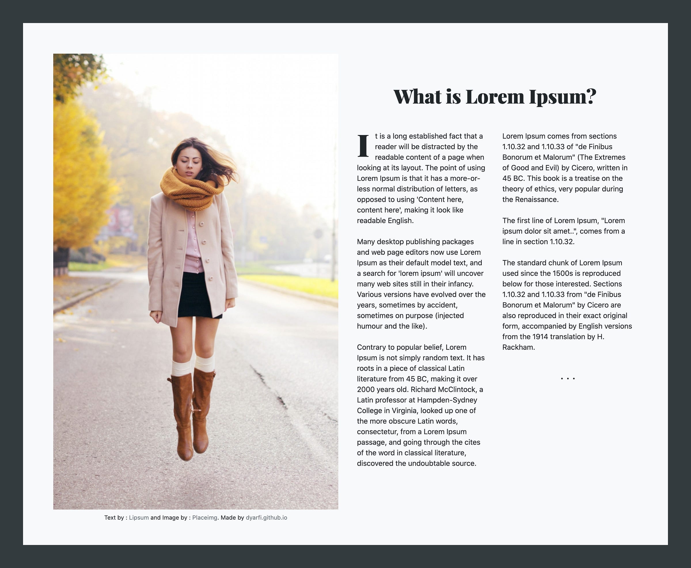
Making Layouts
HTML:
<!DOCTYPE html>
<html lang="en">
<head>
<meta charset="UTF-8" />
<title>CodePen - Magazine Layout look alike HTML</title>
<meta
name="viewport"
content="width=device-width, initial-scale=1, shrink-to-fit=no"
/>
<link
rel="stylesheet"
href="https://cdnjs.cloudflare.com/ajax/libs/twitter-bootstrap/4.4.1/css/bootstrap.min.css"
/>
<link rel="stylesheet" href="./style.css" />
</head>
<body>
<!-- partial:index.partial.html -->
<div class="container-fluid bg-dark p-1 p-sm-5">
<div class="row bg-light no-gutters p-1 p-sm-5">
<div class="col-12 col-sm-12 col-md-12 col-lg-6 col-xl-6">
<div class="container mx-auto">
<img
class="img-fluid ilist-c pt-3 text-center"
src="https://placeimg.com/800/1280/people"
/>
<div class="small mt-2 text-center">
Text by :
<a
href="https://www.lipsum.com/"
target="_blank"
class="text-muted"
>Lipsum</a
>
and Image by :
<a href="https://placeimg.com" target="_blank" class="text-muted"
>Placeimg</a
>. Made by
<a
href="https://dyarfi.github.io/"
target="_blank"
class="text-muted"
>dyarfi.github.io</a
>
</div>
</div>
</div>
<div class="col-12 col-lg-6 col-lg-6 col-xl-6">
<div class="container mx-auto p-2 p-sm-2 p-lg-4">
<div class="row py-2 py-sm-2 py-lg-5">
<div class="col-12">
<h1 class="text-center mb-5 mt-4 mt-lg-2">
What is Lorem Ipsum?
</h1>
</div>
<div class="col-12 col-md-6">
<div class="content">
It is a long established fact that a reader will be distracted
by the readable content of a page when looking at its layout.
The point of using Lorem Ipsum is that it has a more-or-less
normal distribution of letters, as opposed to using 'Content
here, content here', making it look like readable English.
<br /><br />
Many desktop publishing packages and web page editors now use
Lorem Ipsum as their default model text, and a search for
'lorem ipsum' will uncover many web sites still in their
infancy. Various versions have evolved over the years,
sometimes by accident, sometimes on purpose (injected humour
and the like).<br /><br />
Contrary to popular belief, Lorem Ipsum is not simply random
text. It has roots in a piece of classical Latin literature
from 45 BC, making it over 2000 years old. Richard McClintock,
a Latin professor at Hampden-Sydney College in Virginia,
looked up one of the more obscure Latin words, consectetur,
from a Lorem Ipsum passage, and going through the cites of the
word in classical literature, discovered the undoubtable
source.
<br /><br />
</div>
</div>
<div class="col-12 col-md-6">
Lorem Ipsum comes from sections 1.10.32 and 1.10.33 of "de
Finibus Bonorum et Malorum" (The Extremes of Good and Evil) by
Cicero, written in 45 BC. This book is a treatise on the theory
of ethics, very popular during the Renaissance.
<br /><br />The first line of Lorem Ipsum, "Lorem ipsum dolor
sit amet..", comes from a line in section 1.10.32. <br /><br />
The standard chunk of Lorem Ipsum used since the 1500s is
reproduced below for those interested. Sections 1.10.32 and
1.10.33 from "de Finibus Bonorum et Malorum" by Cicero are also
reproduced in their exact original form, accompanied by English
versions from the 1914 translation by H. Rackham.
<div class="text-center h4 mt-5">˙˙˙</div>
</div>
</div>
</div>
</div>
</div>
</div>
<!-- partial -->
</body>
</html>
SCSS:
@import 'https://fonts.googleapis.com/css?family=Playfair+Display:300,400,600,700,900';
body {
  font-size: 0.95rem;
}
h1,
h2,
h3,
h4,
h4 {
  font-family: 'Playfair Display', sans-serif;
  font-weight: 900;
}
.content {
  &:first-letter {
    float: left;
    text-transform: uppercase;
    font-size: 4rem;
    margin-right: 0.75rem;
    padding: 0;
    line-height: 0.9;
    font-family: 'Playfair Display', sans-serif;
    font-weight: 900;
  }
}
.ilist-c {
  filter: none;
  transition: 0.5s ease;
  &:hover {
    filter: contrast(1.12);
  }
}
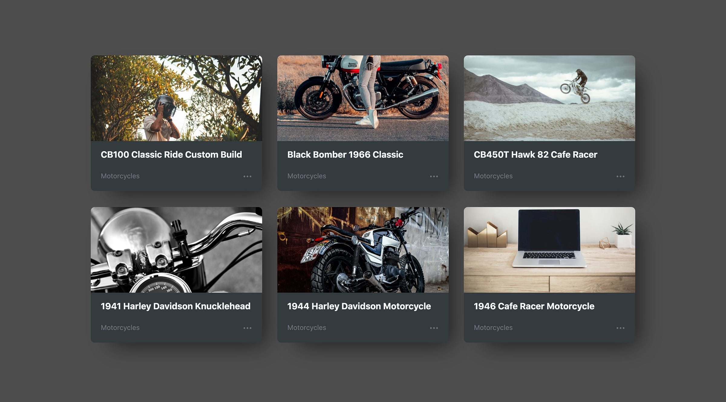
Making Cards
<!DOCTYPE html>
<html lang="en" >
<head>
<meta charset="UTF-8">
<title>CodePen - Custom Cards Component - Dark Theme</title>
<meta name="viewport" content="width=device-width, initial-scale=1, shrink-to-fit=no">
<link rel='stylesheet' href='https://cdnjs.cloudflare.com/ajax/libs/twitter-bootstrap/4.4.1/css/bootstrap.min.css'>
<link rel="stylesheet" href="./style.css">
</head>
<body>
<!-- partial:index.partial.html -->
<div class="container py-5">
<h1 class="text-center font-weight-bold text-light mb-5 pb-3 display-4">Responsive <span class="px-2 bg-secondary">Card</span> Component</h1>
<div class="card-group">
<div class="col-md-4 py-3">
<div class="card text-white bg-dark">
<img src="https://source.unsplash.com/random/800x400/?caferacer" class="card-img-top" alt="Card Component">
<div class="card-body">
<div class="card-title">
<h5><a href="javascript:;">CB100 Classic Ride Custom Build</a></h5>
</div>
<!-- <p>Customized for enjoying the steet ride.</p> -->
</div>
<div class="card-footer bg-dark">Motorcycles <a href="javascript:;" class="text-secondary float-right"><span>•••</span></a></div>
</div>
</div>
<div class="col-md-4 py-3">
<div class="card text-white bg-dark">
<img src="https://source.unsplash.com/random/800x400/?biker" class="card-img-top" alt="Card Component">
<div class="card-body">
<div class="card-title">
<h5><a href="javascript:;">Black Bomber 1966 Classic</a></h5>
</div>
<!-- <p>Owner's wanted to have a new classic touch.</p> -->
</div>
<div class="card-footer bg-dark">Motorcycles <a href="#" class="text-secondary float-right"><span>•••</span></a></div>
</div>
</div>
<div class="col-md-4 py-3">
<div class="card text-white bg-dark">
<img src="https://source.unsplash.com/random/800x400/?moto" class="card-img-top" alt="Card Component">
<div class="card-body">
<div class="card-title">
<h5><a href="javascript:;">CB450T Hawk 82 Cafe Racer</a></h5>
</div>
<!-- <p>Custom build into cafe racer motorbike.</p> -->
</div>
<div class="card-footer bg-dark">Motorcycles <a href="#" class="text-secondary float-right"><span>•••</span></a></div>
</div>
</div>
<div class="col-md-4 py-3">
<div class="card text-white bg-dark">
<img src="https://source.unsplash.com/random/800x400/?harley" class="card-img-top" alt="Card Component">
<div class="card-body">
<div class="card-title">
<h5><a href="javascript:;">1941 Harley Davidson Knucklehead</a></h5>
</div>
</div>
<div class="card-footer bg-dark">Motorcycles <a href="#" class="text-secondary float-right"><span>•••</span></a></div>
</div>
</div>
<div class="col-md-4 py-3">
<div class="card text-white bg-dark">
<img src="https://source.unsplash.com/random/800x400/?scrambler" class="card-img-top" alt="Card Component">
<div class="card-body">
<div class="card-title">
<h5><a href="javascript:;">1944 Harley Davidson Motorcycle</a></h5>
</div>
</div>
<div class="card-footer bg-dark">Motorcycles <a href="#" class="text-secondary float-right"><span>•••</span></a></div>
</div>
</div>
<div class="col-md-4 py-3">
<div class="card text-white bg-dark">
<img src="https://source.unsplash.com/random/800x400/?motorcycle,technology" class="card-img-top" alt="Card Component">
<div class="card-body">
<div class="card-title">
<h5><a href="javascript:;">1946 Cafe Racer Motorcycle</a></h5>
</div>
</div>
<div class="card-footer bg-dark">Motorcycles <a href="#" class="text-secondary float-right"><span>•••</span></a></div>
</div>
</div>
</div>
<!-- partial -->
<script src="./script.js"></script>
</body>
</html>
SCSS:
@import url('https://fonts.googleapis.com/css?family=Merriweather:400,700,900&display=swap');
body {
  background-color: hsl(0, 0%, 30%);
}
h1,
h2,
h3,
h4,
h5 {
  font-weight: 700;
}
a {
  color: var(--light);
  &:hover {
    color: var(--secondary);
  }
}
h5 {
  font-size: 1.1rem;
}
/** Bootstrap Cards **/
.card {
  border: 0px;
  border-radius: 0.5rem;
  overflow: hidden;
  transition: transform 0.3s cubic-bezier(0.68, -0.55, 0.265, 1.55), box-shadow
      0.3s cubic-bezier(0.68, -0.55, 0.265, 1.55);
  will-change: transform, box-shadow;
  box-shadow: 23px 21px 43px -17px rgba(0, 0, 0, 0.6);
  margin-bottom: 1rem;
  &:hover {
    transform: translateY(-10px);
    box-shadow: 23px 21px 43px -17px rgba(0, 0, 0, 0.75);
  }
  .card-title {
    margin-top: 0;
    margin-bottom: 0;
  }
  .card-body {
    overflow: hidden;
    padding-top: 1rem;
    padding-bottom: 0.15rem;
    height: 100%;
  }
  .card-footer {
    border: 0px;
    background-color: white;
    font-size: 0.85rem;
    color: var(--secondary);
    padding-bottom: 1.25rem;
  }
}
Making a Text Glowing Arts

HTML and SCSS setup with minimal tags such as HELLO WORLD, start the CSS magic begin.
body {
  background-color: black;
  margin: 5rem 4rem;
  text-align: center;
  font-family: 'Poppins', 'sans-serif';
}
h1,
h2 {
  margin: 0;
  padding: 0;
  color: white;
  display: inline-block;
  font-size: 10rem;
  text-shadow: 0 0 10px #fff, 0 0 20px #fff, 0 0 30px #e60073, 0 0 40px #e60073,
    0 0 50px #e60073, 0 0 60px #e60073, 0 0 70px #e60073;
}
h2 {
  font-size: 8rem;
}
@for $j from 0 through 5 {
  h1:nth-child(0n + #{$j}),
  h2:nth-child(5n + #{$j}) {
    animation-name: animateGlithcy;
    animation-delay: #{$j/5}s;
    animation-duration: #{$j/2}s;
    animation-timing-function: linear;
    animation-direction: alternate-reverse;
    animation-iteration-count: infinite;
  }
}
@keyframes animateGlithcy {
  0% {
    opacity: 0.1;
    background-position: 0 0;
    filter: hue-rotate(0deg);
  }
  10% {
    background-position: 5px 0;
  }
  20% {
    background-position: -5px 0;
  }
  30% {
    background-position: 15px 0;
  }
  40% {
    background-position: -5px 0;
  }
  50% {
    background-position: -25px 0;
  }
  60% {
    background-position: -50px 0;
  }
  70% {
    background-position: 0 -20px;
  }
  80% {
    background-position: -60px -20px;
  }
  81% {
    background-position: 0 0;
  }
  100% {
    opacity: 1;
    background-position: 0 0;
    filter: hue-rotate(360deg);
  }
}
SCSS has other features that can leverage CSS pseudo-elements such as ::before and ::after. Check out our blog post here to learn more about how to utilize them in SCSS with samples.
Read our blog posts on SCSS to enhance your familiarity with this powerful CSS preprocessor. Explore here to learn about the benefits and fun aspects of using Sass, and dive into here to discover how to leverage SCSS functions, including for and each, for more efficient and dynamic styling capabilities.
Topics
Recent Blog List Content:
Most popular React.js UI Libraries - Exploring Mantine and Material-UI